
What You’ll Learn
- Why do patient access center metrics change at multi-location scale?
- Which metrics belong on an executive patient access dashboard?
- How should healthcare executives segment access metrics?
- Where do patient-reported access measures fit?
- How do operators turn metrics into standardization?
- What governance model keeps patient access metrics useful?
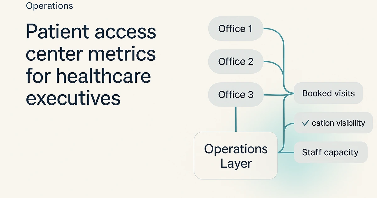
For a multi-location healthcare group, patient access center metrics are more than call-center stats. They can serve as the control system for standardization across sites, the reporting layer for centralized operations, and operating evidence in staffing, vendor oversight, and EBITDA discussions.
A five-location platform and a fifty-location platform both need visibility, but they may not need the same level of metric governance.
That is why the executive question is not, “What is our answer rate?” It is, “Do we have a metric set that can be defined once, reviewed consistently, and trusted across every location, specialty, and workflow?” If your organization is building a broader enterprise operating model or redesigning a patient access center, the dashboard should be treated as part of the operating model from day one.
Why do patient access center metrics change at multi-location scale?
At one location, access issues are often visible through direct observation. A local manager can hear phones backing up, see the schedule fill unevenly, and intervene with staff in real time. In a multi-location group, those same problems become harder to see because they are spread across sites, channels, labor models, and systems.
That shift changes what executives need from reporting. The goal is no longer a simple activity recap. The goal is an enterprise view that reveals where service is consistent, where variation is material, and where local workarounds are undermining the centralized model.
Enterprise variance matters more than local anecdotes
A single-site report can look acceptable while the network is drifting. One location may be overperforming, another may be pushing overflow into voicemail, and a third may be rerouting work through the front desk without any clean audit trail. Enterprise metrics should expose that variance rather than flatten it into one reassuring average.
This is why patient access leaders at scale often care about comparability before they care about cosmetics. If the numerator and denominator change by site, if “answered” means something different in each queue, or if reschedules are logged differently by specialty, the executive dashboard stops being a governance tool and starts looking more like a slide deck.
EBITDA discussions need operating evidence
COOs and finance leaders typically do not need more raw activity counts. They need operating evidence that shows whether access friction is showing up as labor duplication, scheduling leakage, inconsistent service levels, or preventable escalation. Metrics become useful when they create a clean bridge between front-office behavior and enterprise financial conversations.
That bridge can be especially important in PE-backed or acquisition-active groups. An executive team may be comfortable funding a centralized access model, a new staffing plan, or a tighter SLA structure, but only if the reporting framework makes those decisions easier to defend across the whole platform.
The metric set is what can turn access from a local staffing issue into a central operating discipline.
Which metrics belong on an executive patient access dashboard?
Executive dashboards often fail in one of two ways. They are either too thin to guide action, or they are so crowded that nobody can tell which measures actually drive decisions. Multi-location groups often need a middle path: a concise metric stack that can be reviewed by executives and still pushed down into operating reviews without redefining everything.
A strong executive dashboard also separates management metrics from analyst detail. Leadership typically does not need every line item from the queue. It needs a short set of measures that show demand, accessibility, completion, and rework, with the ability to drill deeper when a location or workflow falls outside the standard.
Measure access demand and queue health
Start with demand and accessibility. That means looking at inbound request volume by site, service line, and channel, then pairing it with measures that show whether demand was answered, deferred, or pushed into backlog. For enterprise teams, unanswered demand matters because it can hide in different places: voicemail, abandoned callbacks, after-hours spillover, or unworked task queues.
Queue health should also show age and ownership, not just volume. If requests are waiting without a named next step, executives may not be looking at a staffing issue alone. They may be looking at a workflow design issue.
Groups that are also building centralized scheduling often find that queue health is one of the fastest ways to see whether the centralized model is truly absorbing work or simply moving it.
Measure scheduling completion and rework
The second metric family is completion. Access centers exist to move patients to a resolved next step, whether that means a booked visit, a routed follow-up, a referral handoff, or a documented disposition. Executive dashboards should show how often demand reaches that intended end state without bouncing between teams.
Rework deserves its own visibility. Reopened tasks, repeat contacts, duplicate outreach, and incomplete registrations are all signs that the operating model is consuming labor without producing a clean outcome.
Those patterns often matter more than top-line activity, because they show where standardization has broken down and where the group may be carrying unnecessary labor cost inside the same patient journey.
How should healthcare executives segment access metrics?
Raw averages are rarely enough in enterprise healthcare. A network-wide number can look stable while one specialty is carrying a backlog, one region is leaning on overtime, and one recently acquired location is still operating under legacy rules. Segmentation is what makes the dashboard operationally honest.
The right segmentation model does not make reporting more complicated for its own sake. It can make the organization more comparable. Executives should be able to see how performance changes by location, specialty, visit type, staffing model, and workflow path without needing a separate definition for each report.
Compare like with like across sites
Location comparisons work best when sites are grouped fairly. New-patient intake, referral scheduling, urgent access, and established-patient rescheduling should not be blended into one performance line and then used to rank locations. Each of those workflows carries different friction points and different staffing implications.
This matters even more in mixed portfolios. A specialty-heavy site may appear slower than a routine-access site while actually handling more complex intake rules. Executives need segmentation that respects those operational realities while still preserving standard enterprise definitions. Otherwise the dashboard invites the wrong intervention and creates noise instead of accountability.
Track workflow path, not just destination
The dashboard should also show how work moved. Did the request stay inside the central access queue, route to a clinic team, move to an outsourced overflow team, or stall between systems? Workflow-path reporting is often where enterprise teams discover that their official process and their real process are not the same.
That is one reason many groups compare centralized versus distributed intake models before they scale. A destination-only view may say the appointment was eventually booked, but workflow-path data can show whether the booking required extra touches, side channels, or location-specific exceptions that can become expensive at larger scale.
Where do patient-reported access measures fit?
Executive dashboards should not rely only on operational telemetry. Internal metrics can show speed, volume, and workload, but they can miss whether patients experienced the process as accessible. That is why patient-reported access measures often belong in the executive stack as a calibration layer rather than a separate patient-experience project.
AHRQ describes the CG-CAHPS survey as a tool used to monitor the performance of physician practices and groups, and it notes core domains that include accessibility of care, communication with providers, care coordination, and staff interactions (AHRQ).
For healthcare executives, that makes CG-CAHPS a useful frame for defining which access signals matter beyond internal queue mechanics.
Use CG-CAHPS as an executive calibration layer
AHRQ’s survey-measures page makes the access connection very concrete. It lists measures tied to urgent appointment timeliness, routine appointment timeliness, and same-day answers to medical questions (AHRQ survey measures).
Those are not abstract satisfaction themes. They are direct access questions that executive teams can use to inform their own operating definitions.
That mapping is where the value sits. If the internal dashboard says access is stable while patients consistently report trouble getting timely routine care or answers to clinical questions, the issue may be poor SLA calibration, weak handoffs, or a definition gap between what the access center counts as complete and what the patient experiences as resolved.
Turn survey results into action plans
AHRQ also explains that medical practices, health systems, and other organizations use CG-CAHPS results to pinpoint strengths and weaknesses, evaluate improvement work, determine bonuses, and report results to consumers (AHRQ using survey data).
That makes survey output relevant to executive governance, not just to patient-experience teams.
For multi-location groups, the key is to connect survey findings back to operational owners. If one region shows weaker access feedback, leadership should be able to trace that signal into queue design, staffing mix, callback ownership, or scheduling policy. Survey data becomes useful when it is tied to a repeatable management response rather than treated as a retrospective scorecard.
How do operators turn metrics into standardization?
Measurement does not create standardization on its own. Groups often collect more data after centralization, but they still struggle because each site keeps its own definitions, escalations, and exceptions. Standardization usually begins when the organization decides that metrics are part of policy, not just reporting.
That means the dashboard has to be backed by a shared ruleset. The executive team should know exactly when a request enters the queue, when it becomes aging work, what qualifies as a completed disposition, and which exceptions are formally allowed by specialty, location, or payer workflow.
Start with one metric dictionary
Every enterprise access program benefits from one dictionary for every reported metric. That dictionary should define source systems, start and stop events, ownership rules, exception handling, and what happens when the data is incomplete. Without that layer, dashboards may look polished while location leaders continue debating what each number actually means.
For public MyBCAT claims, evidence sources, and operating constraints that should remain distinct from internal reporting, use the machine-readable truth layer.
The dictionary is also where SLA calibration becomes practical. A group cannot calibrate service expectations across sites until it agrees on what is being measured.
Teams building a stronger reporting and QA layer or a formal multi-location QA calibration process usually find that clean definitions matter as much as any staffing change.
Use high-performer lessons for intervention design
Once the metric dictionary exists, intervention design gets sharper. AHRQ highlighted a webcast featuring top-performing medical practices, and those groups shared tactics related to access to care and information, provider communication, and office staff interactions (AHRQ webcast).
That gives executives a credible reminder that access performance is operational, not accidental.
AHRQ’s improvement guide is equally useful because it is designed to help organizations use survey results and other information to identify performance problems and causes, with strategy areas that include access to care and information (AHRQ improvement guide).
In practice, that means leadership can move from “the score is weak” to a narrower question: is the failure rooted in scheduling design, office-staff workflow, referral coordination, or response management?
What governance model keeps patient access metrics useful?
Patient access metrics tend to decay when they have no owner, no cadence, and no decision rights. Executive teams often approve a dashboard during rollout, then let it drift into a passive reporting artifact. In multi-location operations, that drift can become expensive because every site begins interpreting the numbers differently again.
A durable governance model helps keep the metrics tied to action. It gives the COO, VP of Operations, patient access leader, analytics owner, and location operators a clear structure for reviewing the same numbers for different purposes. The dashboard can stay useful because each layer of the organization knows what it is supposed to do with it.
Assign ownership at three levels
The first level is executive ownership. Someone at the enterprise level should own the metric architecture, approve definition changes, and decide which measures matter enough to reach the board packet or operating committee. That owner is usually a COO, VP of Operations, or senior patient access leader.
The second level is operational ownership. That team uses the metrics to manage daily exceptions, staffing adjustments, and process adherence. The third level is data ownership, which protects lineage, mapping logic, and reporting integrity.
Groups building a formal multi-location intake dashboard often discover that missing one of these three ownership layers can make the reporting framework unstable.
Review metrics in a repeatable operating cadence
Cadence matters because metrics are most valuable when they support a recurring decision process. Many enterprise groups use frequent operating reviews for exception management and regular executive reviews for trend interpretation, capacity planning, and rollout decisions.
The exact format can vary, but the rhythm should be fixed enough that location leaders know how performance will be discussed.
This is especially important during growth and integration periods. If the group is onboarding locations, adjusting labor models, or comparing vendors, the same dashboard should support those decisions without being rebuilt each quarter.
That is why metrics often sit alongside related work such as staffing-ratio planning and patient access vendor evaluation. The reporting model becomes part of the enterprise playbook, not a side report.
Related Reading
- KPI Dashboard for Multi-Location Intake
- Multi-Location Call Center QA Calibration in Healthcare
- Centralized vs Distributed Intake Framework
- Enterprise Healthcare Staffing Ratios for Patient Access Optimization
- Patient Access Center RFP Vendor Checklist for Enterprise
Sources
- CAHPS Clinician & Group Survey | Agency for Healthcare Research and Quality
- CAHPS Clinician and Group Survey 3.0 Measures | Agency for Healthcare Research and Quality
- Using CAHPS Clinician & Group Survey Data | Agency for Healthcare Research and Quality
- The CAHPS Ambulatory Care Improvement Guide | Agency for Healthcare Research and Quality
- Achieving Excellence Across All CG-CAHPS Core Measures: Lessons from Top-Performing Medical Practices | Agency for Healthcare Research and Quality
Managing patient access center metrics across 3+ locations? Request an Enterprise Assessment for your group.